new look at cdp!
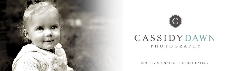
After weeks, and weeks on working on a new logo, I am proud to say it's done! I have wanted to change my logo for quite a while...actually, soon after I made it. Now that I have graduated and Justin and I are semi-settled in an area for a while, I really would like my business to pick up. I have many things in mind (hopefully a website will be coming soon) and I thought one of the best things to revive it would be a new look! So here we are, the new logo. What I really like is that it is versatile. The "C" in the background will change colors when I feel necessary (I am on a yellow kick, but I'm sure that won't last too long). I love that it is classic but still fun, sophisticated but not pretentious, stylish but not flashy.
Hopefully it will carry me through for a while; I think it is a good reflection of what I want the business to be.
Let me know your thoughts; I'd love to hear them!


4 comments:
Looks great. You sure use a lot of big words these days. :-)
I think it's pretty...and it kind of has a retro-modern combo look. Love that!
What does pretentious mean?
Looks kewl!! Yuze kin tell she be a college grajewit wit all dem fancy-pants words 'n such. I'm still tryin' ta figger out whut a logo iz!! :-)
Cuz
Post a Comment